Non-parametric Methods
Adam J Sullivan
Assistant Professor of Biostatistics
Brown University
Non Parametric Statistics
What are they?
- Non parametrics means that you do not need to specify a specific distribution for the data.
- Many of the methods you have learned up to this point require data dealing with the normal distribution.
- This is due partially to the fact that the t-distribution, \(\chi^2\) distribution, and the \(F\) distribution can all be derived from the normal distribution.
- Traditionally you are just taught to use normallity and made to either transform the data or just go ahead knowing it is incorrect.
Normal vs Skewed Data
- Data that is normally distributed has:
- the mean and the median the same.
- The data is centered about the mean.
- Very specific probability values.
- Data that is skewed has:
- Mean less than median for left skewed data.
- Mean greater than median for right skewed data.
Why is this an issue?
- In 1998 a survey was given to Harvard students who entered in 1973:
- The mean salary was $750,000
- The median salary was $175,000
- What could be a problem with this?
- What happened here?
Why do we use Parametric Models?
- Parametric Models have more power so can more easily detect significant differences.
- Given large sample size Parametric models perform well even in non-normal data.
- Central limit theorem states that in research that can be perfromed over and over again, that the means are normally distributed.
- There are methods to deal with incorrect variances.
Why do we use Non Parametric Models?
- Your data is better represented by the median.
- You have small sample sizes.
- You cannot see the ability to replicate this work.
- You have ordinal data, ranked data, or outliers that you can’t remove.
What Non Parametric Tests will we cover?
- Sign Test
- Wilcoxon Signed-Rank Test
- Wilcoxon Rank-Sum Test (Mann-Whitney U Test, ...)
- Kruskal Wallis test
- Spearman Rank Correlation Coefficient
- Bootstrapping
The sign Test
The Sign Test
- The sign test can be used when comparing 2 samples of observarions when there is not independence of samples.
- It actually does compares matches together in order to accomplish its task.
- This is similar to the paired t-test
- No need for the assumption of normality.
- Uses the Binomial Distribution
Steps of the Sign Test
- We first match the data
- Then we subtract the 2nd value from the 1st value.
- You then look at the sign of each subtraction.
- If there is no difference between the two groups you shoul have roughly 50% positives and 50% negatives.
- Compare the proportion of positives you have to a binomial with p=0.5.
Example: Binomial Test Function
- Consider the scenario where you have patients with Cystic Fibrosis and health individuals.
- Each subject with CF has been matched to a healthy individual on age, sex, height and weight.
- We will compare the Resting Energy Expenditure (kcal/day)
Reading in the Data
library(readr)
ree <- read_csv("ree.csv")
ree
## # A tibble: 13 x 2
##       CF Healthy
##    <dbl>   <dbl>
##  1  1153     996
##  2  1132    1080
##  3  1165    1182
##  4  1460    1452
##  5  1634    1162
##  6  1493    1619
##  7  1358    1140
##  8  1453    1123
##  9  1185    1113
## 10  1824    1463
## 11  1793    1632
## 12  1930    1614
## 13  2075    1836
Function in R
- Comes from the
BDSAPackage
SIGN.test(x ,y, md=0, alternative = "two.sidesd",
conf.level=0.95)
- Where
xis a vector of valuesyis an optional vector of values.mdis median and defaults to 0.alternativeis way to specific type of test.conf.levelspecifies \(1-\alpha\).
Getting Package
# install.packages("devtools")
# devtools::install_github('alanarnholt/BSDA')
Our Data
library(BSDA)
attach(ree)
SIGN.test(CF, Healthy)
detach()
Our Data
##
##  Dependent-samples Sign-Test
##
## data:  CF and Healthy
## S = 10, p-value = 0.02
## alternative hypothesis: true median difference is not equal to 0
## 95 percent confidence interval:
##   25.4 324.5
## sample estimates:
## median of x-y
##           161
##
## Achieved and Interpolated Confidence Intervals:
##
##                   Conf.Level L.E.pt U.E.pt
## Lower Achieved CI      0.908   52.0    316
## Interpolated CI        0.950   25.4    324
## Upper Achieved CI      0.978    8.0    330
By "Hand"
- Subtract Values
library(tidyverse)
ree <- ree %>%
mutate(diff = CF - Healthy)
ree
By "Hand"
- count negatives
## # A tibble: 13 x 3
##       CF Healthy  diff
##    <dbl>   <dbl> <dbl>
##  1  1153     996   157
##  2  1132    1080    52
##  3  1165    1182   -17
##  4  1460    1452     8
##  5  1634    1162   472
##  6  1493    1619  -126
##  7  1358    1140   218
##  8  1453    1123   330
##  9  1185    1113    72
## 10  1824    1463   361
## 11  1793    1632   161
## 12  1930    1614   316
## 13  2075    1836   239
By "Hand"
binom.test(2,13)
##
##  Exact binomial test
##
## data:  2 and 13
## number of successes = 2, number of trials = 10, p-value = 0.02
## alternative hypothesis: true probability of success is not equal to 0.5
## 95 percent confidence interval:
##  0.0192 0.4545
## sample estimates:
## probability of success
##                  0.154
Wilcoxon Signed-Rank Test
Wilcoxon Signed-Rank Test
- The sign test works well but it truly ignores the magntiude of the differences.
- Sign test often not used due to this problem.
- Wilcoxon Signed Rank takes into account both the sign and the rank
How does it work?
- Pairs the data based on study design.
- Subtracts data just like the sign test.
- Ranks the magnitude of the difference:
8
-17
52
-76
What happens with these ranks?
| Subtraction | Positive Ranks | Negative Ranks |
|---|---|---|
| 8 | 1 | |
| -17 | -2 | |
| 52 | 3 | |
| -76 | -4 | |
| Sum | 4 | -6 |
What about after the sum?
- \(W_{+}= 1 + 3 = 4\)
- \(W_{-} + -2 + -4 = -6\)
- Mean: \(\dfrac{n(n+1)}{4}\)
- Variance: \(\dfrac{n(n+1)(2n+1)}{24}\)
What about after the sum?
- Any ties, \(t\): decrease variance by \(t^3-\dfrac{t}{48}\)
- z test:
\[ z =\dfrac{W_{smaller}- \dfrac{n(n+1)}{4}}{\sqrt{\dfrac{n(n+1)(2n+1)}{24}-t^3-\dfrac{t}{48}}}\]
Wilcoxon Signed Rank in R
attach(ree)
wilcox.test(CF, Healthy, paired=T)
detach(ree)
##
##  Wilcoxon signed rank test
##
## data:  CF and Healthy
## V = 80, p-value = 0.005
## alternative hypothesis: true location shift is not equal to 0
Wilcoxon Rank-Sum Test
Wilcoxon Rank-Sum Test
- This test is used on indepdent data.
- It is the non-parametric version of the 2-sample \(t\)-test.
- Does not requre normality or equal variance.
How do we do it?
- Order each sample from least to greatest
- Rank them.
- Sum the ranks of each sample
What do we do with summed ranks?
- \(W_s\) smaller of 2 sums.
- Mean: \(\dfrac{n_s(n_s+n_L + 1)}{2}\)
- Variance: \(\dfrac{n_sn_L(n_s+n_L+1)}{12}\)
- z-test
\[ z = \dfrac{W_s-\dfrac{n_s(n_s+n_L + 1)}{2}}{\sqrt{\dfrac{n_sn_L(n_s+n_L+1)}{12}}}\]
Wilcoxon Rank-Sum in R
- Consider built in data
mtcars
library(tidyverse)
cars <- as_data_frame(mtcars)
cars
## # A tibble: 32 x 11
##      mpg   cyl  disp    hp  drat    wt  qsec    vs    am  gear  carb
##    <dbl> <dbl> <dbl> <dbl> <dbl> <dbl> <dbl> <dbl> <dbl> <dbl> <dbl>
##  1  21       6  160    110  3.9   2.62  16.5     0     1     4     4
##  2  21       6  160    110  3.9   2.88  17.0     0     1     4     4
##  3  22.8     4  108     93  3.85  2.32  18.6     1     1     4     1
##  4  21.4     6  258    110  3.08  3.22  19.4     1     0     3     1
##  5  18.7     8  360    175  3.15  3.44  17.0     0     0     3     2
##  6  18.1     6  225    105  2.76  3.46  20.2     1     0     3     1
##  7  14.3     8  360    245  3.21  3.57  15.8     0     0     3     4
##  8  24.4     4  147.    62  3.69  3.19  20       1     0     4     2
##  9  22.8     4  141.    95  3.92  3.15  22.9     1     0     4     2
## 10  19.2     6  168.   123  3.92  3.44  18.3     1     0     4     4
## # ... with 22 more rows
Wilcoxon Rank-Sum in R
- We will Consider
mpgandam mpg: Miles Per Gallon on Averageam- 0: automatic transmission
- 1: manual transmission
Wilcoxon Rank-Sum in R
attach(cars)
wilcox.test(mpg, am)
detach(cars)
##
##  Wilcoxon rank sum test with continuity correction
##
## data:  mpg and am
## W = 1000, p-value = 3e-12
## alternative hypothesis: true location shift is not equal to 0
Kruskal Wallis Test
Kruskal Wallis Test
- If we have multiple groups of independent data that are not normally distributed or have variance issues, you can use the Kruskal Wallis Test.
- It tests significant differences in medians of the groups.
- This is a non-parametric method for One-Way ANOVA.
- Harder to try and calculate by hand, so we will just use R.
Kruskal Wallis Test in R
kruskal.test(formula, data, subset, ...)
- Where
formulaisy~xor can enteroutcome,groupinstead.datais the dataframe of interest.subsetif you wish to test subset of data.
Arthritis Data
- comes from the
BSDApackage. Arthriti
| Variable | Description |
|---|---|
time |
Time in Days until patient felt relief |
treatment |
Factor with three levels A, B, and C |
Arthritis Data
library(BSDA)
Arthriti
## # A tibble: 51 x 2
##     time treatment
##    <int> <fct>
##  1    40 A
##  2    35 A
##  3    47 A
##  4    52 A
##  5    31 A
##  6    61 A
##  7    92 A
##  8    46 A
##  9    50 A
## 10    49 A
## # ... with 41 more rows
Kruskal-Wallis Test in R
kruskal.test(time~treatment, data=Arthriti)
##
##  Kruskal-Wallis rank sum test
##
## data:  time by treatment
## Kruskal-Wallis chi-squared = 2, df = 2, p-value = 0.4
Spearman Rank Correlation Coefficient
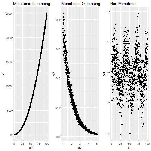
Spearman Rank Correlation Coefficient
- Correlation is a measurement of the strength of a linear relationship between variables.
- This means it does not necessarily get the actual magnitude of relationship.
- Spearman Rank Correlation seeks to fix this.
- It works with Montonic Data.
Monotonic Data
Spearman Rank Correlation in R
- We can do this the the
cor()function.
#Pearson from Monotonic Decreasing
cor(x2,y2, method="pearson")

#Spearman from Monotonic Decreasing
cor(x2,y2, method="spearman")
## [1] -0.887
## [1] -0.996
Smoothing
Smoothing
- Smoothing is a very powerful technique used all across data analysis.
- It is designed to detect trends in the presence of noisy data in cases in which the shape of the trend is unknown.
- The smoothing name comes from the fact that to accomplish this feat, we assume that the trend is smooth, as in a smooth surface.
Smoothing
Why Smoothing?
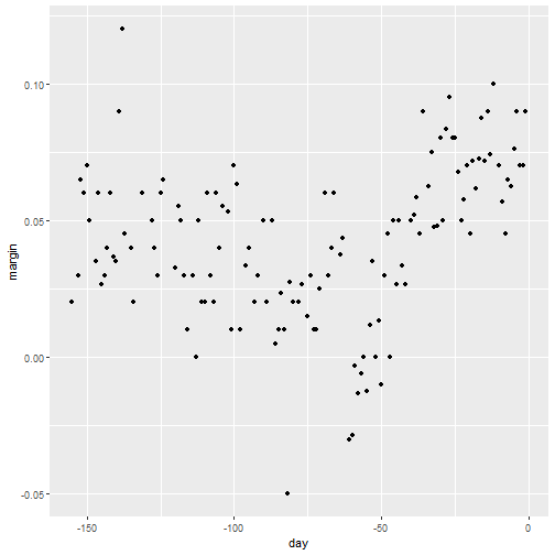
- Lets focus on one covariate
- Let's estimate a time trend on popular vote poll margins
library(tidyverse)
library(dslabs)
data("polls_2008")
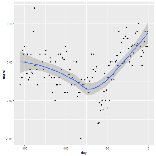
qplot(day, margin, data = polls_2008)
Why Smoothing?
Smoothing Example
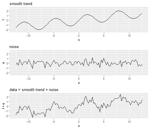
- We assume that for any given day \(x\), there is a true preference among the electorate \(f(x)\), but due to the uncertainty introduced by the polling, each data point comes with an error \(\varepsilon\).
- A mathematical model for the observed poll margin \(Y_i\) is: \[ Y_i = f(x_i) + \varepsilon_i \]
- If we knew the conditional expectation \(f(x) = \mbox{E}(Y \mid X=x)\), we would use it.
- Since we don't know this conditional expectation, we have to estimate it.
Smoothing Example
- Let's use regression
resid <- ifelse(lm(margin~day, data = polls_2008)$resid > 0, "+", "-")
polls_2008 %>%
  mutate(resid = resid) %>%
  ggplot(aes(day, margin)) +
  geom_smooth(method = "lm", se = FALSE, color = "black") +
  geom_point(aes(color = resid), size = 3)
Smoothing Example
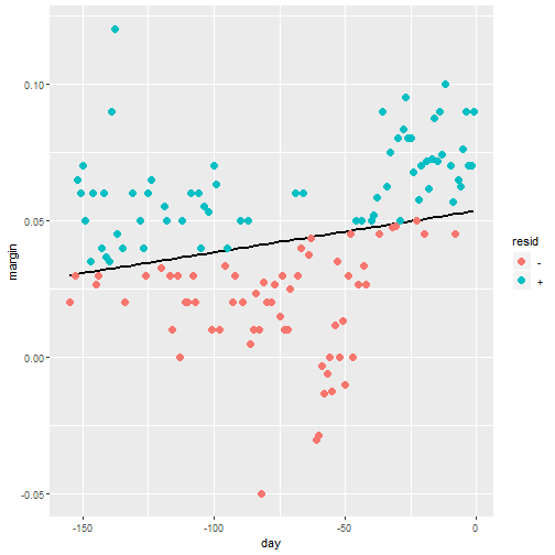
Smoothing Example
- The lines do not fit the data well.
- There is not an evenn distribution of positive and negative residuals.
- There is also not a clear pattern like a polynomial terms we could add.
Bin smoothing
- The general idea of smoothing is to group data points into strata in which the value of \(f(x)\) can be assumed to be constant.
- We can make this assumption because we think \(f(x)\) changes slowly and, as a result, \(f(x)\) is almost constant in small windows of time.
- An example of this idea for the
poll_2008data is to assume that public opinion remained approximately the same within a week's time. With this assumption in place, we have several data points with the same expected value.
Bin smoothing
- If we fix a day to be in the center of our week, call it \(x_0\), then for any other day \(x\) such that \(|x - x_0| \leq 3.5\), we assume \(f(x)\) is a constant \(f(x) = \mu\).
- This assumption implies that: \[ E[Y_i | X_i = x_i ] \approx \mu \mbox{ if } |x_i - x_0| \leq 3.5 \]
- In smoothing, we call the size of the interval satisfying \(|x_i - x_0| \leq 3.5\) the window size, bandwidth or span.
- Later we will see that we try to optimize this parameter.
Bin smoothing
- This assumption implies that a good estimate for \(f(x)\) is the average of the \(Y_i\) values in the window.
- If we define \(A_0\) as the set of indexes \(i\) such that \(|x_i - x_0| \leq 3.5\) and \(N_0\) as the number of indexes in \(A_0\), then our estimate is: \[ \hat{f}(x_0) = \frac{1}{N_0} \sum_{i \in A_0} Y_i \]
- The idea behind bin smoothing is to make this calculation with each value of \(x\) as the center.
- In the poll example, for each day, we would compute the average of the values within a week with that day in the center.
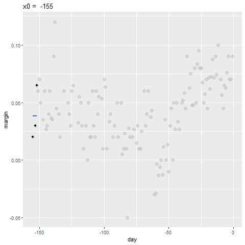
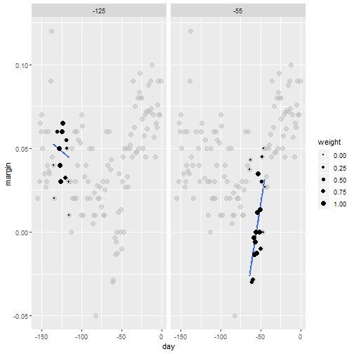
Bin smoothing
- Here are two examples: \(x_0 = -125\) and \(x_0 = -55\).
- The blue segment represents the resulting average.
span <- 3.5
tmp <- polls_2008 %>%
  crossing(center = polls_2008$day) %>%
  mutate(dist = abs(day - center)) %>%
  filter(dist <= span)

tmp %>% filter(center %in% c(-125, -55)) %>%
  ggplot(aes(day, margin)) +
  geom_point(data = polls_2008, size = 3, alpha = 0.5, color = "grey") +
  geom_point(size = 2) +
  geom_smooth(aes(group = center),
              method = "lm", formula=y~1, se = FALSE) +
  facet_wrap(~center)
Bin smoothing
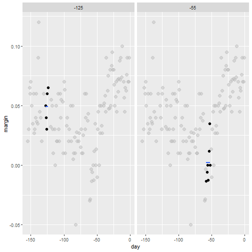
Bin smoothing
- By computing this mean for every point, we form an estimate of the underlying curve \(f(x)\).
- At each value of \(x_0\), we keep the estimate \(\hat{f}(x_0)\) and move on to the next point:
Bin smoothing Animation
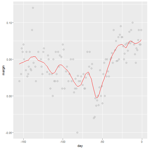
Binsmoothing Results
span <- 7
fit <- with(polls_2008,
            ksmooth(day, margin, x.points = day, kernel="box", bandwidth = span))

polls_2008 %>% mutate(smooth = fit$y) %>%
  ggplot(aes(day, margin)) +
    geom_point(size = 3, alpha = .5, color = "grey") +
  geom_line(aes(day, smooth), color="red")
Binsmoothing Results
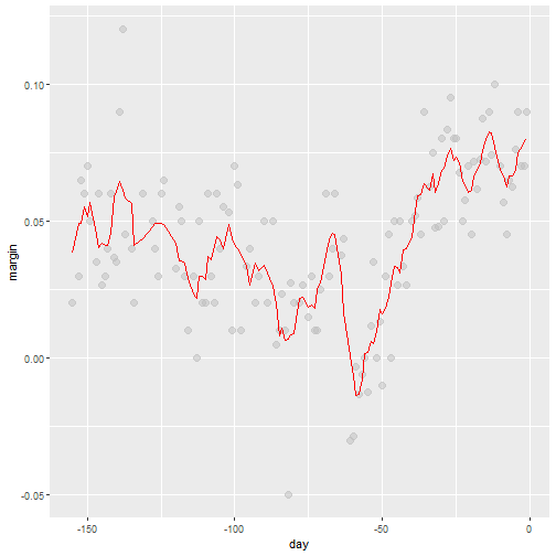
Kernels
- Binsmooth leaves a wiggly results
- This is due to points changing when the window is moved.
- We could weight the center more than outside points to solve this problems.
- Then the outside points no longer have much weight
- This new result would be a weighted average.
Kernels
- Each points receives a weight of either \(0\) or \(1/N_0\), with \(N_0\) the number of points in the week.
\[ \hat{f}(x_0) = \sum_{i=1}^N w_0(x_i) Y_i \]
Kernels
- In the code above, we used the argument
kernel=boxin our call to the functionksmooth. - This is because the weight function looks like a box:
Kernels
Kernels
- The
ksmoothfunction provides a "smoother" option which uses the normal density to assign weights:
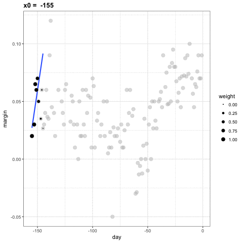
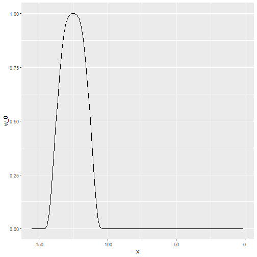
x_0 <- -125
tmp <- with(data.frame(day = seq(min(polls_2008$day), max(polls_2008$day), .25)),
                       ksmooth(day, 1*I(day == x_0), kernel = "normal", x.points = day, bandwidth = span))
data.frame(x = tmp$x, w_0 = tmp$y) %>%
  mutate(w_0 = w_0/sum(w_0)) %>%
  ggplot(aes(x, w_0)) +
  geom_line()
Kernels
Kernels Animation
Kernels Code
The final code and resulting plot look like this:
span <- 7
fit <- with(polls_2008,
            ksmooth(day, margin,  x.points = day, kernel="normal", bandwidth = span))

polls_2008 %>% mutate(smooth = fit$y) %>%
  ggplot(aes(day, margin)) +
  geom_point(size = 3, alpha = .5, color = "grey") +
  geom_line(aes(day, smooth), color="red")
Kernels Code
Kernels Comments
- There are several functions in R that implement bin smoothers.
- One example is
ksmooth, shown above. - Usually more complex methods are preferred.
- Even the averaged one is a bit coarse in places.
Local weighted regression (loess)
- A limitation of the bin smoother approach just described is that we need small windows for the approximately constant assumptions to hold.
- As a result, we end up with a small number of data points to average and obtain imprecise estimates \(\hat{f}(x)\).
- loess. To do this, we will use a mathematical result, referred to as Taylor's Theorem, which tells us that if you look closely enough at any smooth function \(f(x)\), it will look like a line.
loess
- Instead of assuming constand in a window, we assumes it is linear in a local area.
- We can then have larger window sizes than just a constant number.
- Let's consider a 3 week window instead of the 1 week. \[ E[Y_i | X_i = x_i ] = \beta_0 + \beta_1 (x_i-x_0) \mbox{ if } |x_i - x_0| \leq 21 \]
- For every point \(x_0\), loess defines a window and fits a line within that window.
loess
loess Animation
library(broom)
fit <- loess(margin ~ day, degree=1, span = span, data=polls_2008)
loess_fit <- augment(fit)

if(!file.exists(file.path("loess-animation.gif"))){
  p <- ggplot(tmp, aes(day, margin)) +
    scale_size(range = c(0, 3)) +
    geom_smooth(aes(group = center, frame = center, weight = weight), method = "lm", se = FALSE) +
    geom_point(data = polls_2008, size = 3, alpha = .5, color = "grey") +
    geom_point(aes(size = weight, frame = center)) +
    geom_line(aes(x=day, y = .fitted, frame = day, cumulative = TRUE),
              data = loess_fit, color = "red")

  gganimate(p, filename = file.path("loess-animation.gif"), interval= .1)
}
if(knitr::is_html_output()){
  knitr::include_graphics(file.path("loess-animation.gif"))
} else{
  centers <- quantile(tmp$center, seq(1,6)/6)
  tmp_loess_fit <- crossing(center=centers, loess_fit) %>%
    group_by(center) %>%
    filter(day <= center) %>%
    ungroup()

  tmp %>% filter(center %in% centers) %>%
    ggplot() +
    geom_smooth(aes(day, margin), method = "lm", se = FALSE) +
    geom_point(aes(day, margin, size = weight), data = polls_2008, size = 3, alpha = .5, color = "grey") +
    geom_point(aes(day, margin)) +
    geom_line(aes(x=day, y = .fitted), data = tmp_loess_fit, color = "red") +
    facet_wrap(~center, nrow = 2)
}
loess Final Smooth
total_days <- diff(range(polls_2008$day))
span <- 21/total_days

fit <- loess(margin ~ day, degree=1, span = span, data=polls_2008)

polls_2008 %>% mutate(smooth = fit$fitted) %>%
  ggplot(aes(day, margin)) +
  geom_point(size = 3, alpha = .5, color = "grey") +
  geom_line(aes(day, smooth), color="red")
loess Final Smooth
loess spans
- Different spans give us different estimates.
- We can see how different window sizes lead to different estimates:
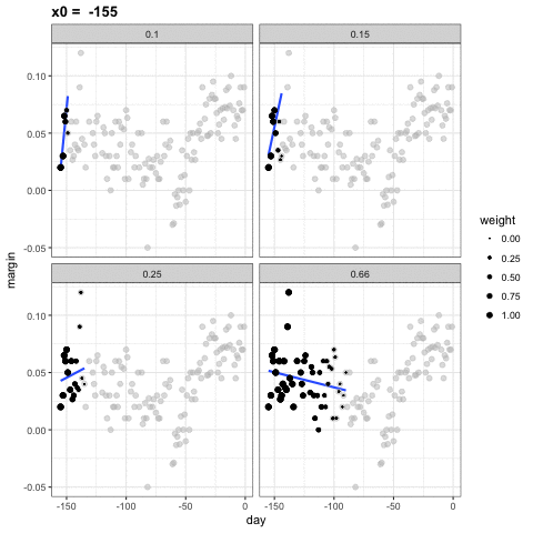
spans <- c(.66, 0.25, 0.15, 0.10)

fits <- data_frame(span = spans) %>%
  group_by(span) %>%
  do(broom::augment(loess(margin ~ day, degree=1, span = .$span, data=polls_2008)))

tmp <- fits %>%
  crossing(span = spans, center = polls_2008$day) %>%
  mutate(dist = abs(day - center)) %>%
  filter(rank(dist) / n() <= span) %>%
  mutate(weight = (1 - (dist / max(dist)) ^ 3) ^ 3)

if(!file.exists(file.path( "loess-multi-span-animation.gif"))){
  p <- ggplot(tmp, aes(day, margin)) +
    scale_size(range = c(0, 2)) +
    geom_smooth(aes(group = center, frame = center, weight = weight), method = "lm", se = FALSE) +
    geom_point(data = polls_2008, size = 2, alpha = .5, color = "grey") +
    geom_line(aes(x=day, y = .fitted, frame = day, cumulative = TRUE),
              data = fits, color = "red") +
    geom_point(aes(size = weight, frame = center)) +
    facet_wrap(~span)

  gganimate(p, filename = file.path( "loess-multi-span-animation.gif"), interval= .1)
}
if(knitr::is_html_output()){
  knitr::include_graphics(file.path("loess-multi-span-animation.gif"))
} else{
  centers <- quantile(tmp$center, seq(1,4)/4)
  tmp_fits <- crossing(center=centers, fits) %>%
    group_by(center) %>%
    filter(day <= center) %>%
    ungroup()

  tmp %>% filter(center %in% centers) %>%
    ggplot() +
    geom_smooth(aes(day, margin), method = "lm", se = FALSE) +
    geom_point(aes(day, margin, size = weight), data = polls_2008, size = 3, alpha = .5, color = "grey") +
    geom_point(aes(day, margin)) +
    geom_line(aes(x=day, y = .fitted), data = tmp_fits, color = "red") +
    facet_grid(span ~ center)
}
loess Smooths
## Error in fortify(data): object 'fits' not found
loess vs Normal Bin Smoother
- There are three other differences between
loessand the typical bin smoother.loesskeeps the number of points used in the local fit the same.- When fitting a line locally,
loessuses a weighted approach. Basically, instead of using least squares, we minimize a weighted version. loesshas the option of fitting the local model robustly. An iterative algorithm is implemented in which, after fitting a model in one iteration, outliers are detected and down-weighted for the next iteration. To use this option, we use the argumentfamily="symmetric".
--- .class #id
loess Keeping Same number of Points
- This number is controlled via the
spanargument, which expects a proportion. - For example, if
Nis the number of data points andspan=0.5, then for a given \(x\),loesswill use the0.5 * Nclosest points to \(x\) for the fit.
-- .class #id
loess Weighted Approach
\[ \sum_{i=1}^N w_0(x_i) \left[Y_i - \left\{\beta_0 + \beta_1 (x_i-x_0)\right\}\right]^2 \]
- Instead of the Gaussian kernel, loess uses a function called the Tukey tri-weight: \[ W(u)= \left( 1 - |u|^3\right)^3 \mbox{ if } |u| \leq 1 \mbox{ and } W(u) = 0 \mbox{ if } |u| > 1 \]
- To define the weights, we denote \(2h\) as the window size and define: \[ w_0(x_i) = W\left(\frac{x_i - x_0}{h}\right) \]
-- .class #id
loess Weighted Approach
- This kernel differs from the Gaussian kernel in that more points get values closer to the max:
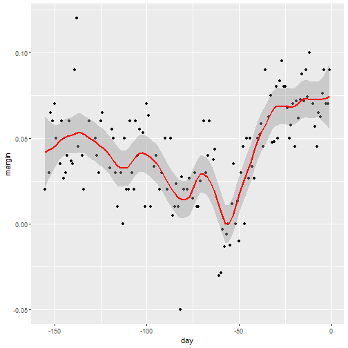
Default Smoothing
ggplotuses loess in itsgeom_smoothfunction:
Default Smoothing
polls_2008 %>% ggplot(aes(day, margin)) +
  geom_point() +
  geom_smooth()
Default Smoothing
- We can change the default smoothing
polls_2008 %>% ggplot(aes(day, margin)) +
  geom_point() +
  geom_smooth(color="red",  span = 0.15,
              method.args = list(degree=1))
Default Smoothing